
The Mythology of Book Covers
/By Tricia Woodcome
Meandering through the Strand Bookstore’s famous 18 miles of books can feel very much like entering Jorge Luis Borges’s infinite Library of Babel. Overflowing carts of $1 used books lure readers to one of New York’s most loved independent bookstores, which lives on the corner of 12th street and Broadway. Tragically incapable of reading everything, all readers must face a choice. Often, the answer boils down to which cover catches your eye first.

The dimensions of an ordinary book are about six-by-nine inches. Imagine holding this book –the weight of its two hundred or so pages, bound either by a stiff hardcover or a more flexible paperback. On the front, you will often see the book’s title and author. Turn it over and you may find a brief synopsis of the story inside – just enough to leave you wondering.
French literary theorist and philosopher Roland Barthes wrote in his 1957 book, Mythologies, “we constantly drift between the object and its demystification, powerless to render its wholeness.”
It's a mythology that can be applied to book covers, which often act as their own entity, separate from the texts they encase, simultaneously representing them and casting them at a distance.
They can also provide a visual gateway into the author’s textual world, giving us bookstore lingerers an immediate impression of the story.

As graphic designer Ben Denzer explains, while bookstores and publishers “can collect data on where and when people purchase a book, you can’t collect data on where and how they discover the book.”
He points to the rise of “bookstagram” or literary Instagram accounts such as @bookriot, @ice_cream_books, or LSP’s very own @theliteraryshowproject, as a testament to the power of images as readers sift through an overwhelming number of potential reads. For example, as more readers discover books online or on their mobile devices, publishing houses have favored larger type to accommodate small screens.
In her contemplative essay titled “The Clothing of Books,” Pulitzer Prize-winning author Jhumpa Lahiri notes that a book cover “transforms the text into an object, something concrete to publish, distribute, and, in the end, sell.”

For Lahiri, the book cover is both a barrier and a gateway, depending on each reader’s reaction. In either case, Lahiri explains, the book cover reflects the increasingly mediated and commercialized relationship between a reader and a book. But it is also, she says, “an interpretation of my words in another language – a visual one.”
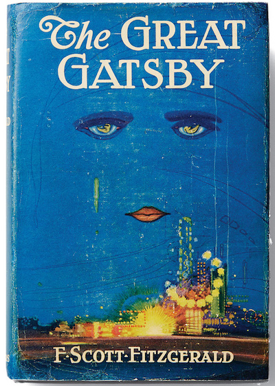
Francis Cugat’s 1925 design for F. Scott Fitzgerald’s The Great Gatsby is an early example of how book covers use key themes and symbols from a text to attract readers. Charles Scribner III, former president of Charles Scribner’s Sons publishing company, describes in illuminating detail of the now famous cover:

“Not illustrative, but symbolic, even iconic: the sad, hypnotic, heavily outlined eyes of a woman beam like headlights through a cobalt night sky. Their irises are transfigured into reclining female nudes. From one of the eyes streams a green luminescent tear; brightly rouged lips complete the sensual triangle. No nose or other discernable facial contours are introduced in this celestial visage; a few dark streaks across the sky (behind the title) suggest hairlines. Below, on earth, brightly colored carnival lights blaze before a metropolitan skyline.”
The vacant gaze conveys the shallow decadence of New York in the roaring 1920s evoked by Fitzgerald, whose narrator, Nick Carraway, laments, “the loneliest moment in someone’s life is when they are watching their whole world fall apart, and all they can do is stare blankly.” Evocation of plot and the glitzy town of West Egg appear before readers even meet the infamous Jay Gatsby, yet the cover maintains enough mystery to entice you to open to the first page.
Graphic designer Chip Kidd treads the thin line between representation and mystery in the covers of more contemporary classics such as David Sedaris’s 1997 memoir Naked. Sedaris’s title story takes place on a nude beach, a setting that catalyzes the author’s confrontation with his own body self-consciousness.
In his 2012 TED Talk, Kidd explains, “a book designer gives form to content, but also manages a very careful balance between the two.” Like Sedaris, who disrobed to explore his deeper psychological handicaps, Kidd’s book cover evokes a plot going far deeper than skin level.
While he doesn’t believe in any hard and fast rules when it comes to designing book covers, Denzer believes that overall, a book cover must be “visually strange” or executed perfectly in order to be successful. He points to Peter Mendelsund’s Kafka series as an example of what works.
As Mendelsund writes, his designs are rooted in Franz Kafka’s ability to arouse “the feeling of the universality of their own alienation.” Unlike Cugat’s gaze on the cover of Gatsby, Mendelsund’s simple yet haunting color-blocked eyes evoke both the anxiety of Kafka’s prose and his adeptness at the “portrayal of the individual, as well as the portrayal of the persecution of the individual.” Down to the typeface, based on Kafka’s own handwriting and called “Mister K,” Mendelsund remains loyal to the author, while breathing a new, visual life into his works.
If a cover should visually represent a text, the copy of The Girl on a Train, which uses images from the book’s film adaptation, does so perhaps to a fault. Rather than luring in readers with a suggestive cover, this design with Emily Blunt gazing out of the moving train, imposes on a reader’s imagination. The popularization of covers inspired by movie adaptations is both a testament to the selling power of recognizable images and the commercialization of reading. Familiar faces sell, so why not use them?
While all book covers act as introductions to their respective texts, not all of them do so through illustrative covers. French publishing houses Les Livres de Poche and Éditions Gallimard have kept their book covers simple and do not shy away from white space. Readers are given three pieces of information: the author’s name, the publishing house, and the book title. In contrast to Kidd and Denzer’s bold and inventive designs, these covers let the text, and therefore writers, speak for themselves.
A book cover’s purpose is to encase and protect the pages inside, but it also serves as an integral part of the book’s existence both physically and in the reader’s mind. Barthes evokes the duality of a book cover’s meaning and form when he describes looking at a landscape through a glass window. “The glass is at once present and empty to me,” he writes, “and the landscape is unreal and full.”
A book cover, like Barthes’ glass window, can render a text unreal or full. The same simultaneous wholeness and emptiness, absence and presence, are also evoked while reading, just as the mysterious relationship between book cover and text, and thus designer and author, skews a reader’s approach to a book. In the infinite library of stories and knowledge, “we constantly drift between the object and its demystification, powerless to render its wholeness”. LSP